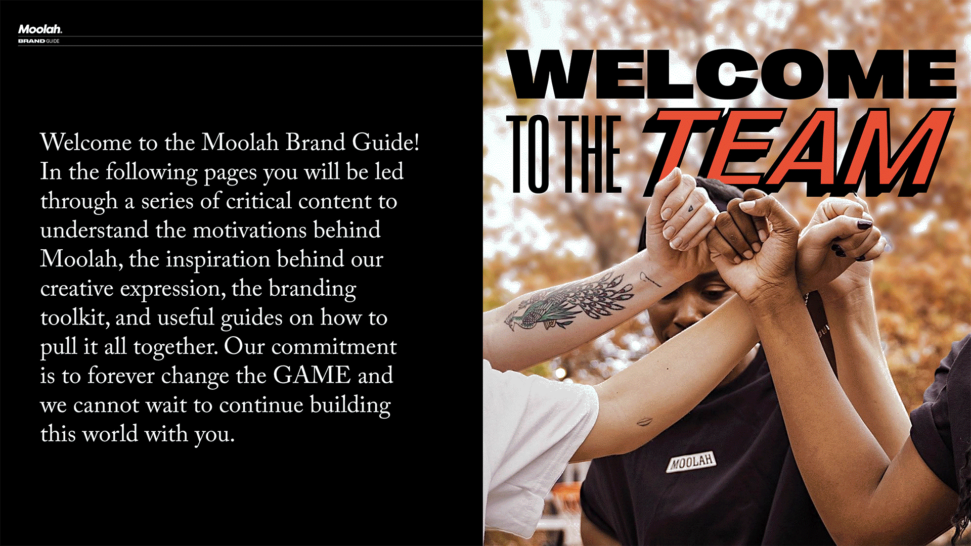
MOOLAH
Brand refresh for a women’s basketball brand redefining visibility, confidence, and culture.
THE CHALLENGE
Moolah’s brand no longer reflected the scale, confidence, or cultural relevance of the platform. The identity needed to mature without losing its edge or mission.
THE INSIGHT
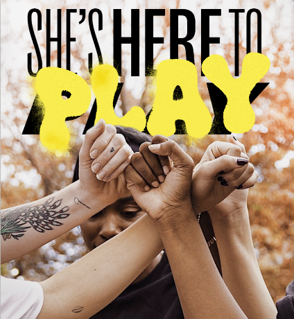
Women’s basketball doesn’t need to be softened or reframed. It needs to be seen clearly and confidently, at full volume.
THE APPROACH
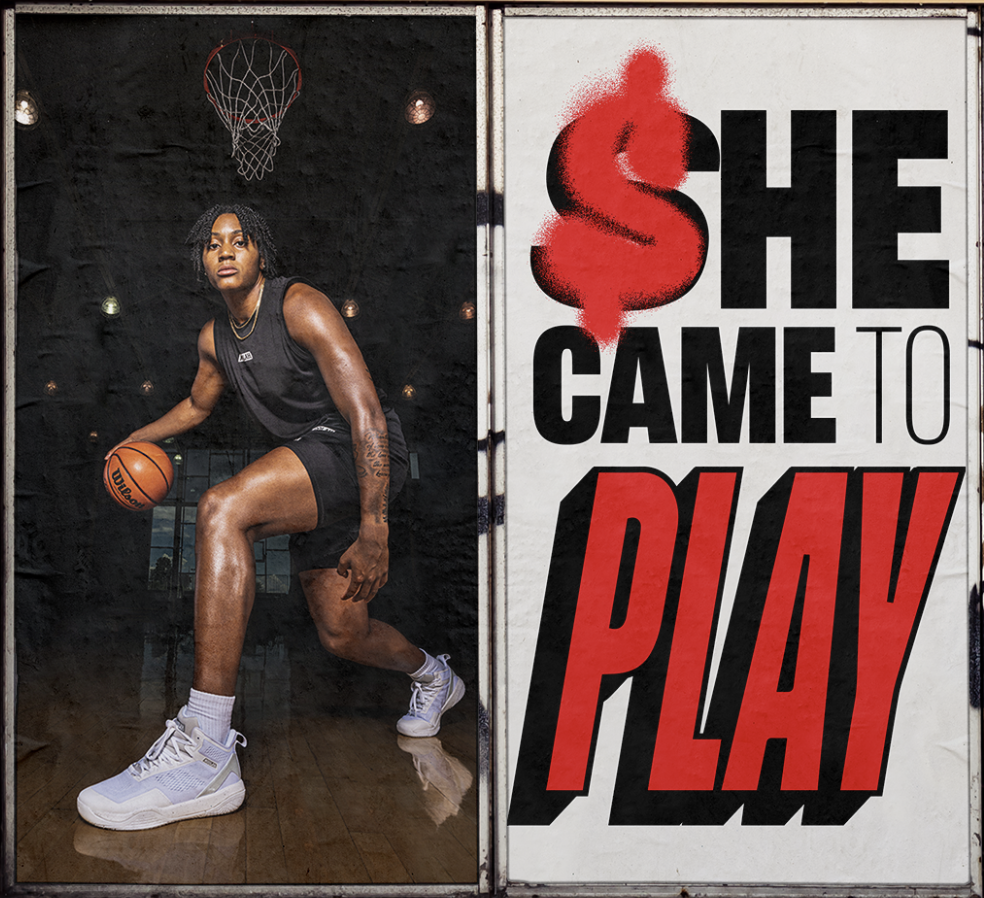
We built a confident, high-impact brand system that reflects the energy of women’s basketball.
ROLE: Freelance creative lead shaping the brand’s vision, voice, and visual system.


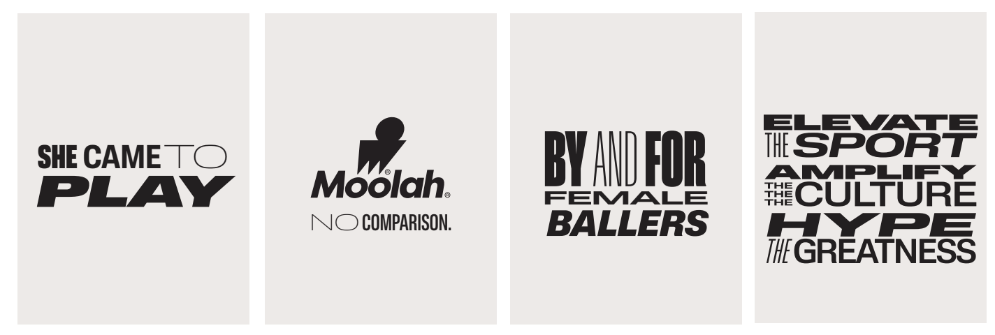
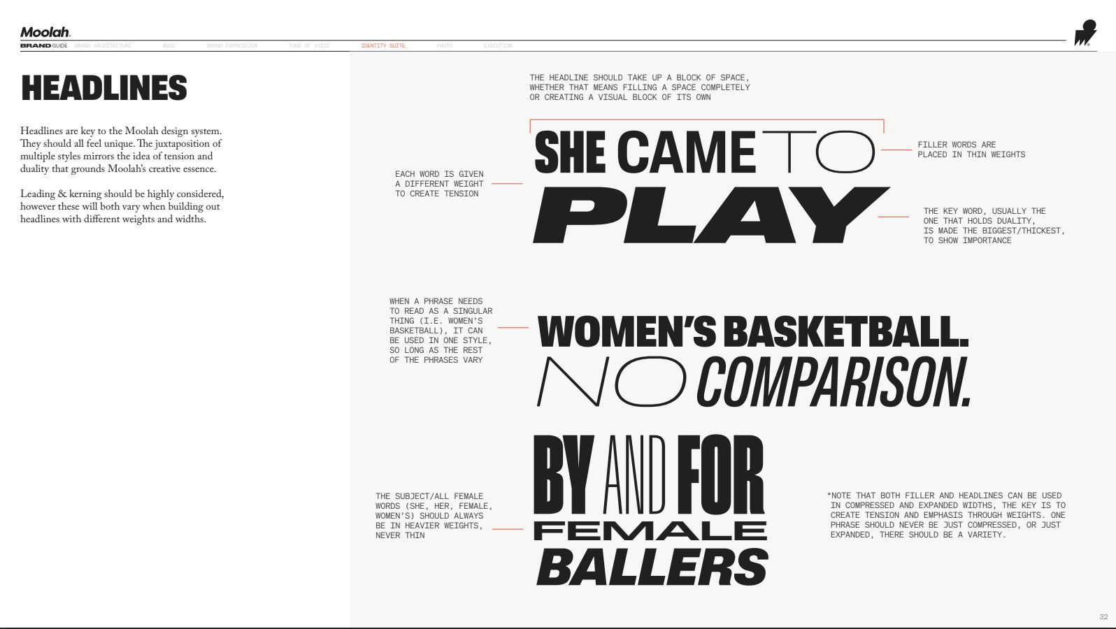
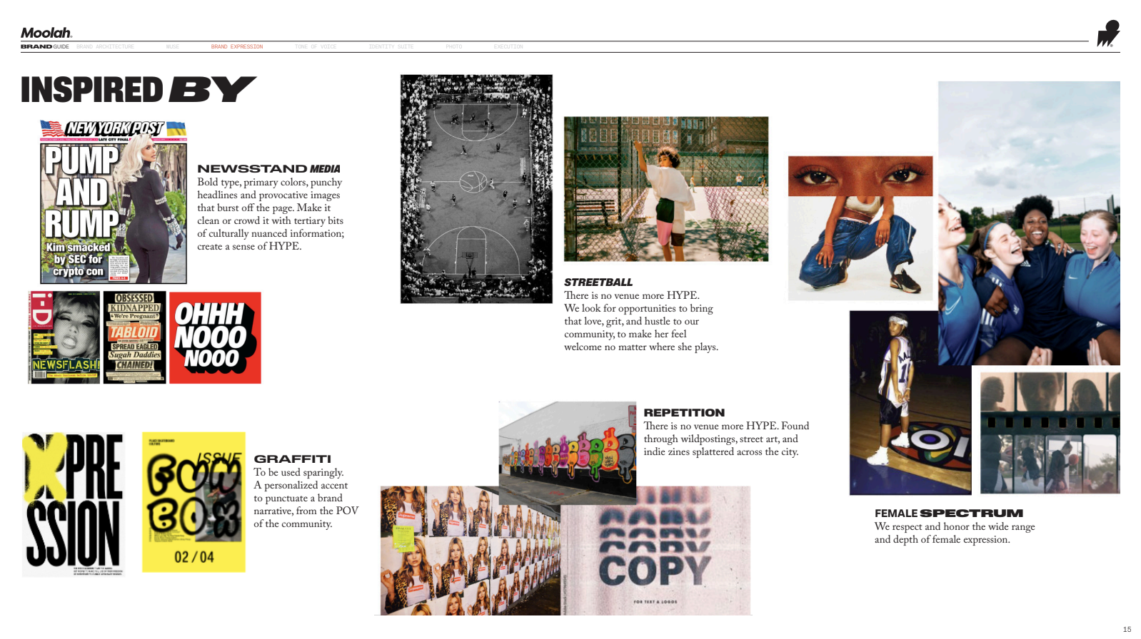
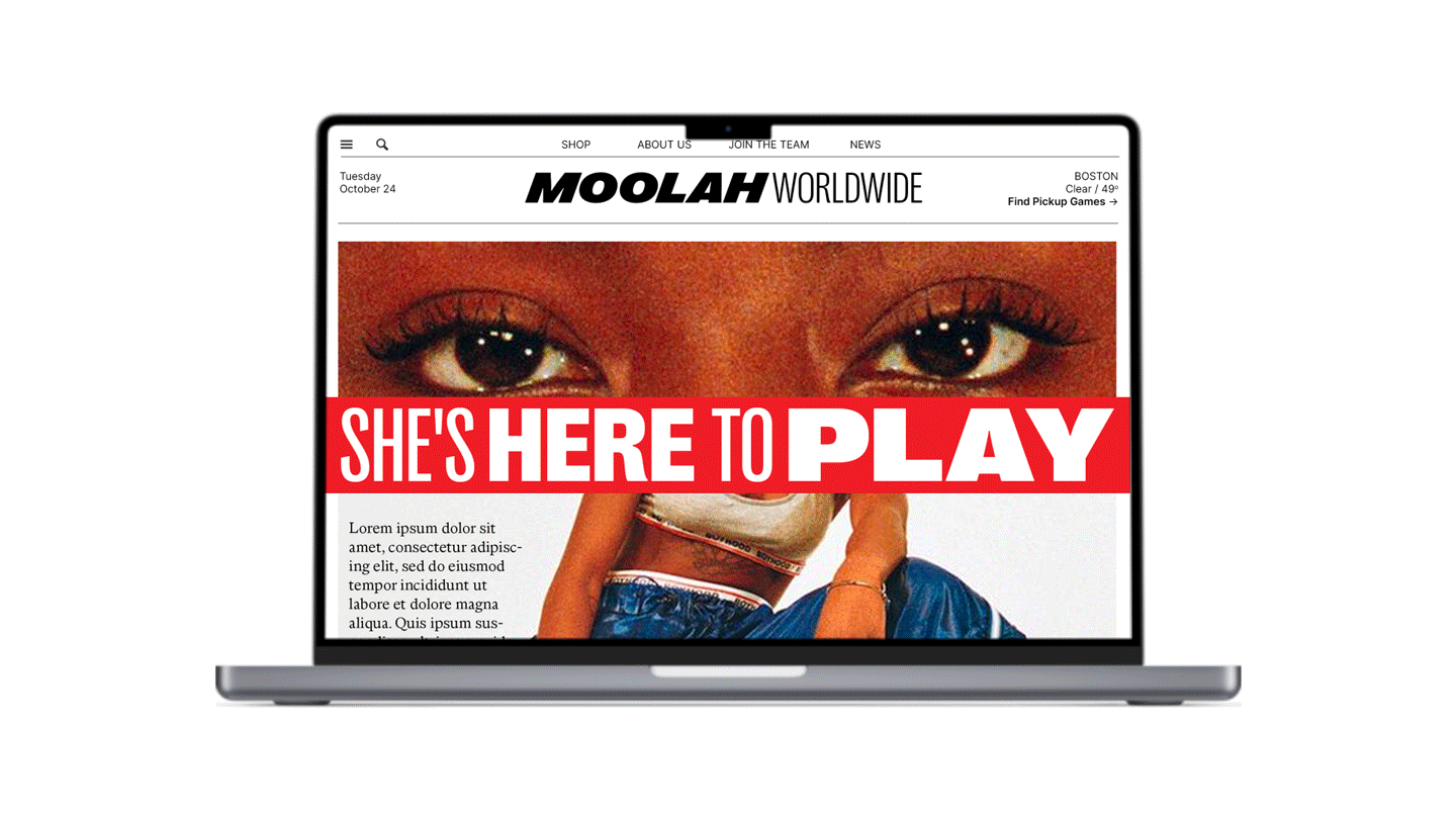
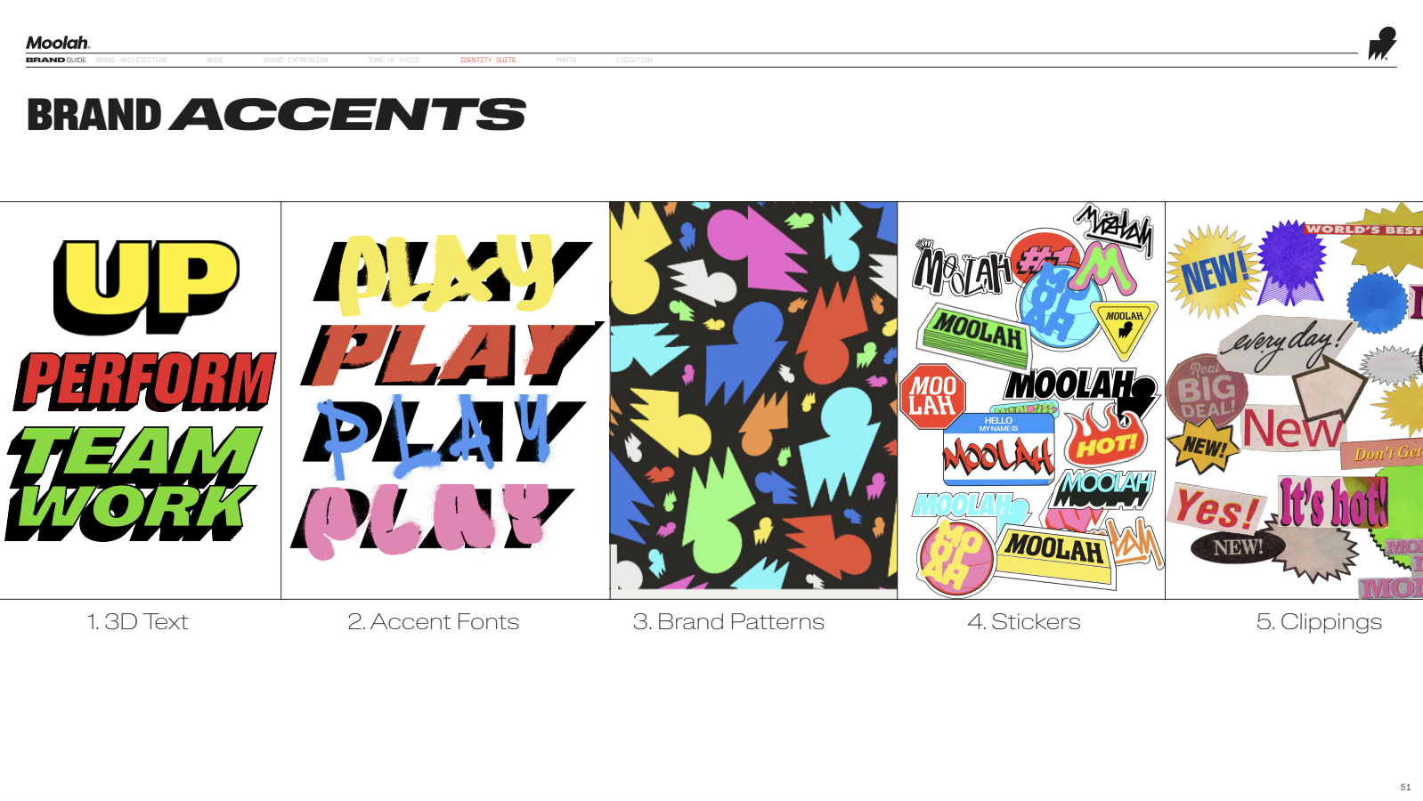
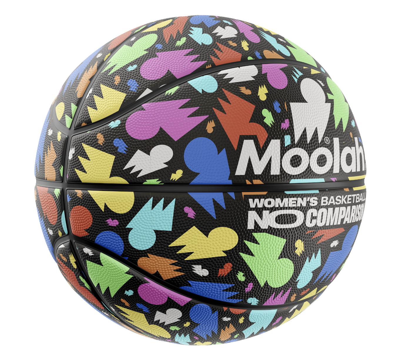
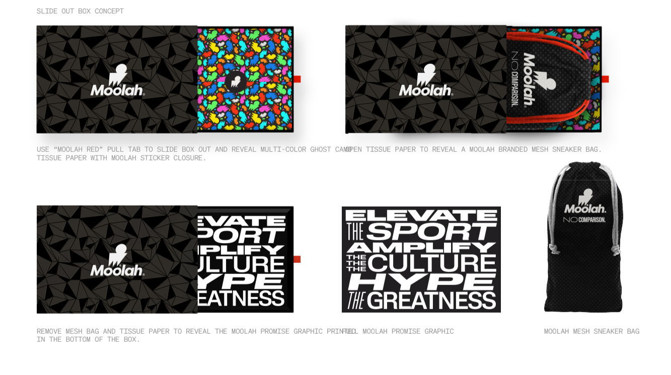
THE SYSTEM
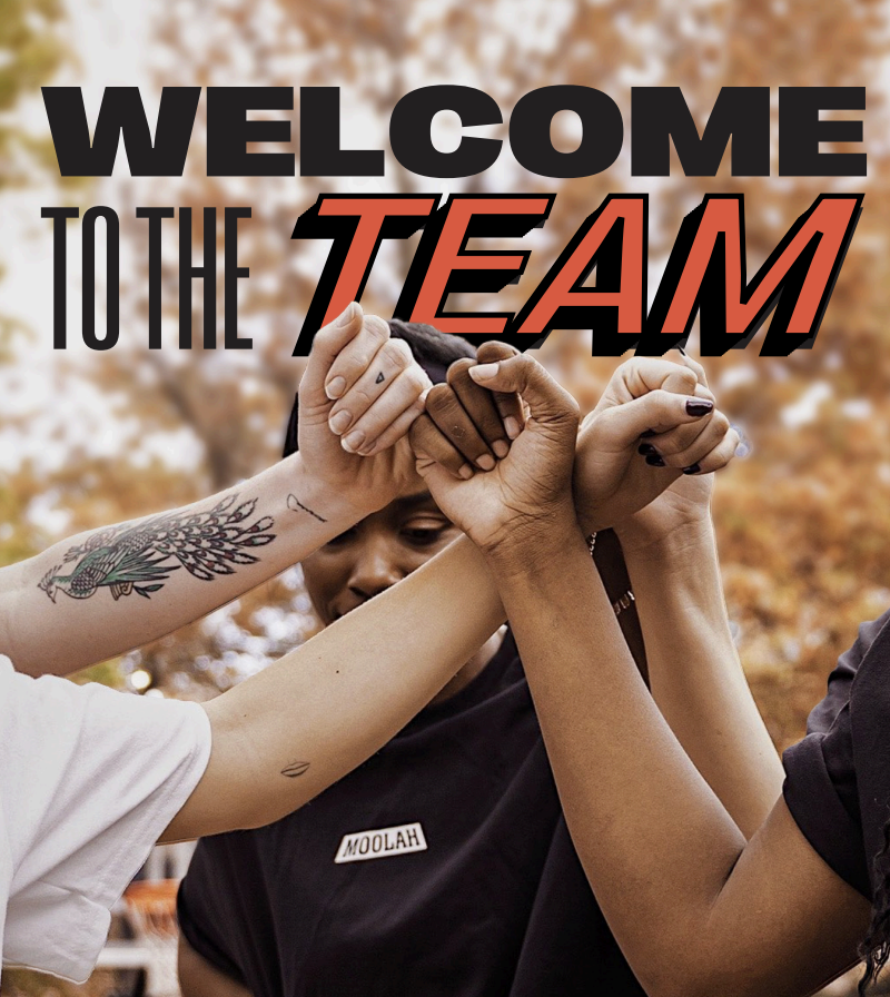
The Moolah brand system established a clear foundation for growth: defining type systems, messaging pillars, and a usable library of graphic elements designed for real-world flexibility. Informed by sports culture, tabloid energy, and bold female expression, the system was built to be expressive but controlled, giving the brand a consistent visual and verbal language that could evolve over time.
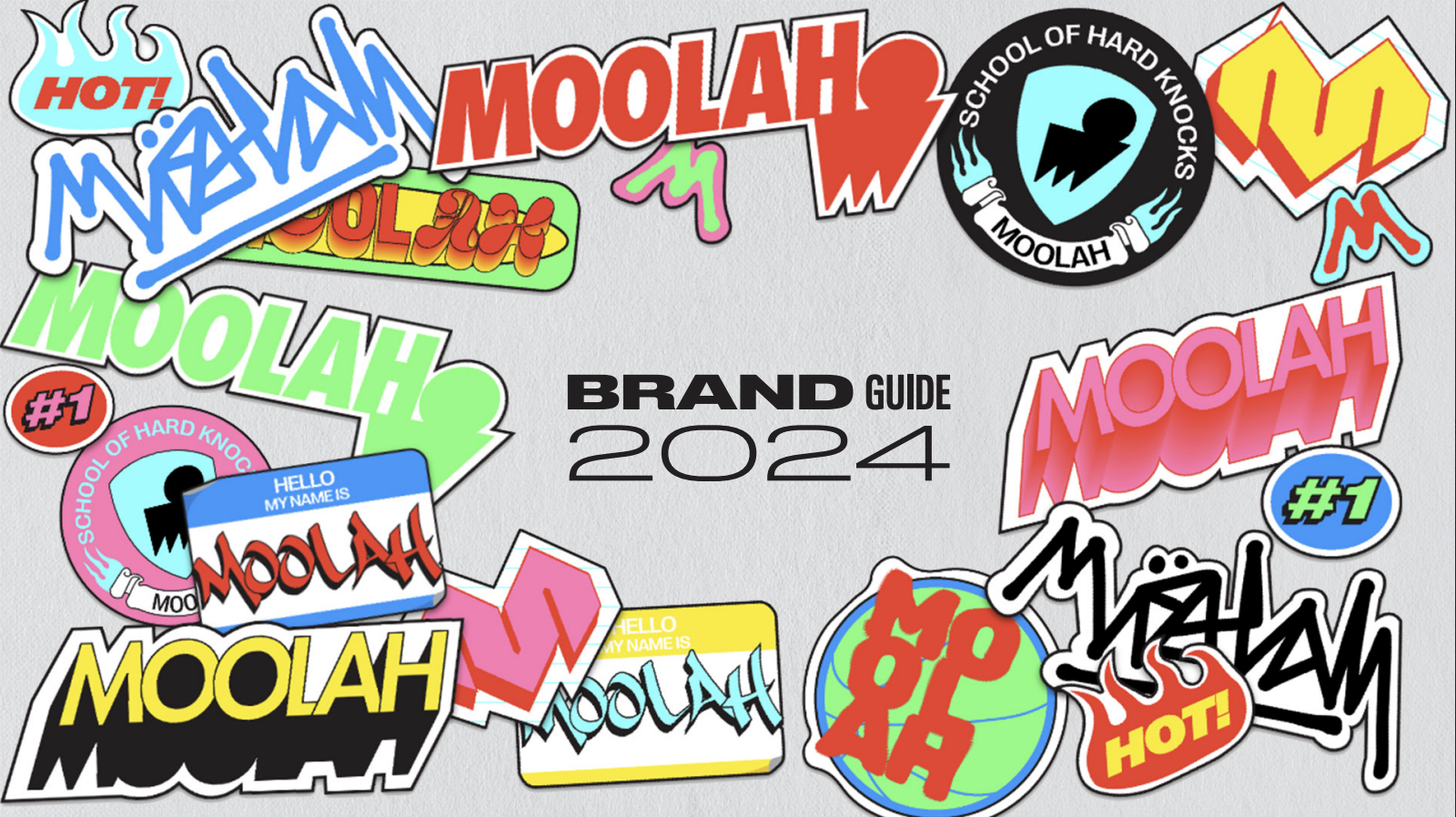
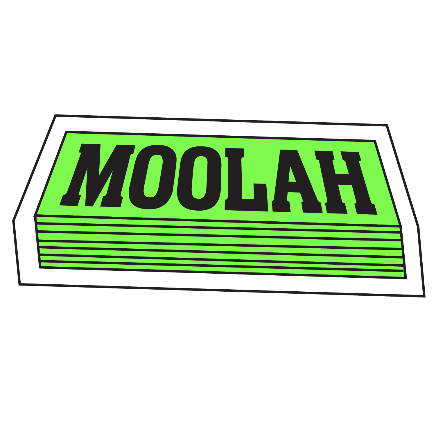
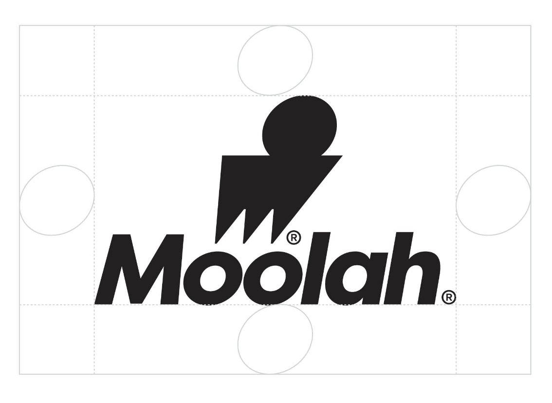
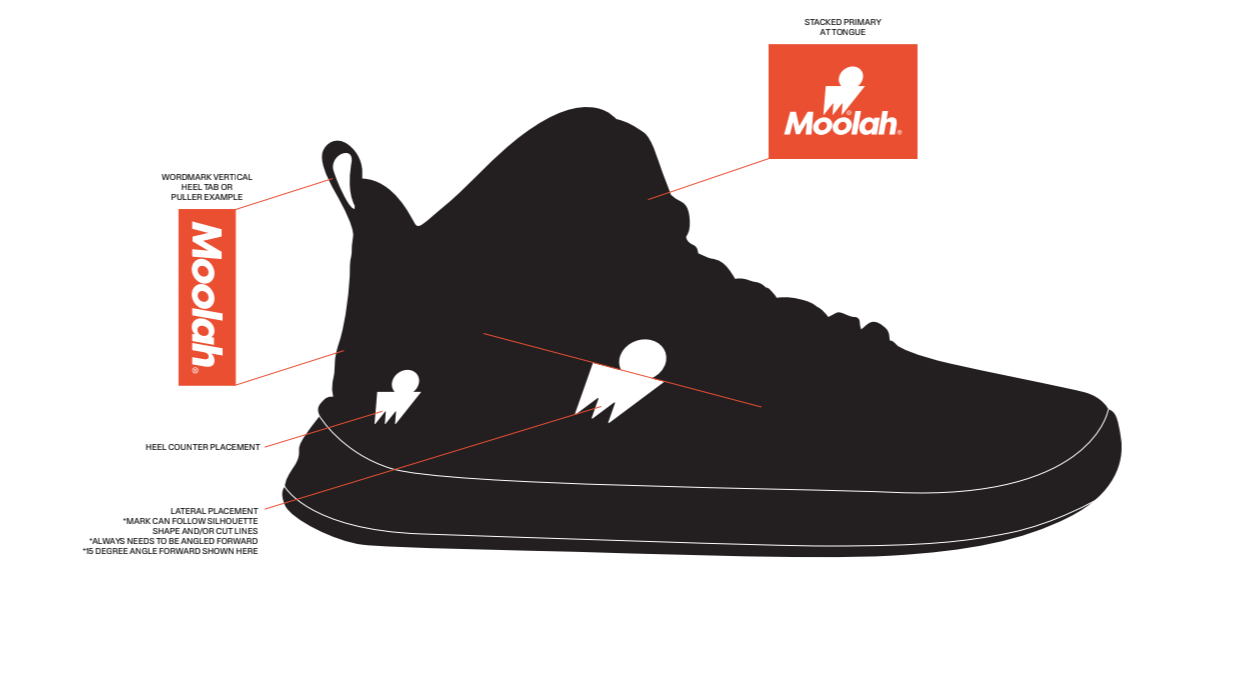
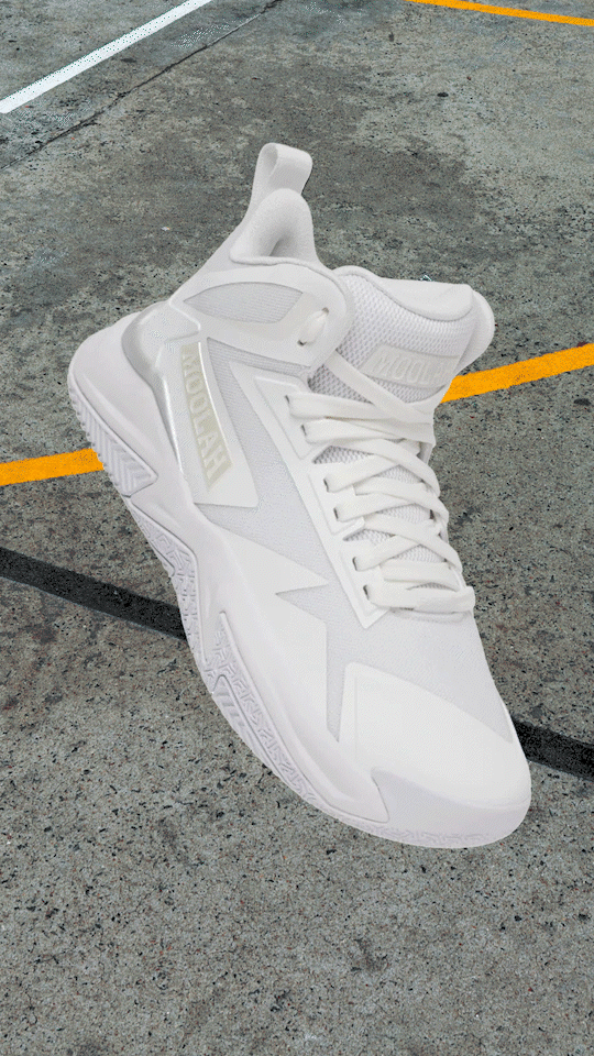
THE LOGO
The logo evolved from a standalone wordmark into a more ownable, modern mark. We created a bold icon and refined typography designed to scale across product, apparel, and digital use.

THE TEAM
Creative Director: Elizabeth McGarry/McGarry&Sons
Design: Danny Finnochio, Emma Snavely
Strategy & Project Management: Rose Sparrow, Sarah Moran